

A comprehensive design for all your summary needs
Annual Report
Role: Graphic Design
Client: Self/Student Work
Duration: April 2025
Team Size: 1
Tools: Adobe Photoshop, Adobe Illustrator, and Adobe InDesign
What is it?
The Marion Polk Food Share 2025 Annual Report is a mockup of imagined information meant to demonstrate my ability to utilize Adobe Creative Suite products, make decisions in hierarchy regarding typography and color choice, and have confidence in layout and design. Font choice was integral in this design as well, with careful consideration being put into the best combination for best results.
The Problem
The idea was that Marion County approached me to design an annual report. It was expressed that I was allowed total creative freedom with the choice of color, font and overall design being up to me, with the copy being sent over.
The solution
For the color design, I wanted to keep the signature green color of Marion Polk county. To balance the green, I chose the shade, the highlight and the complementary color. For the font, I was looking for a bold serif for the headers and an easy to read sans serif for the body copy and any labels. The layout was researched and compared to other annual layout designs available online.
The Design Process

Researching existing designs online brought me to a combination of a minimal design that followed a pattern, for consistency and legibility. Opposite to that was a varied approach, but the pages were related to one another. I kept the idea of the relatability with the color scheme.
Design Sketches

This was the very beginning of my design process. I wanted to get a sketch of how I envisioned the layout of the report. I had the idea of keeping it clean and minimal, as this felt like the best way for the information to be “read” by investors.
Layout Sketches

At this point, I had researched different fonts, colors, and the optional logo colors. The logo color variations were in case the color of the page was something other than green if the logo needed to be added into the page for any reason. The hexagon design was scrapped as a page filler and instead a frame for pictures.
Moodboard design
Final Design

Cover Design

Table of Contents

Mission Statement
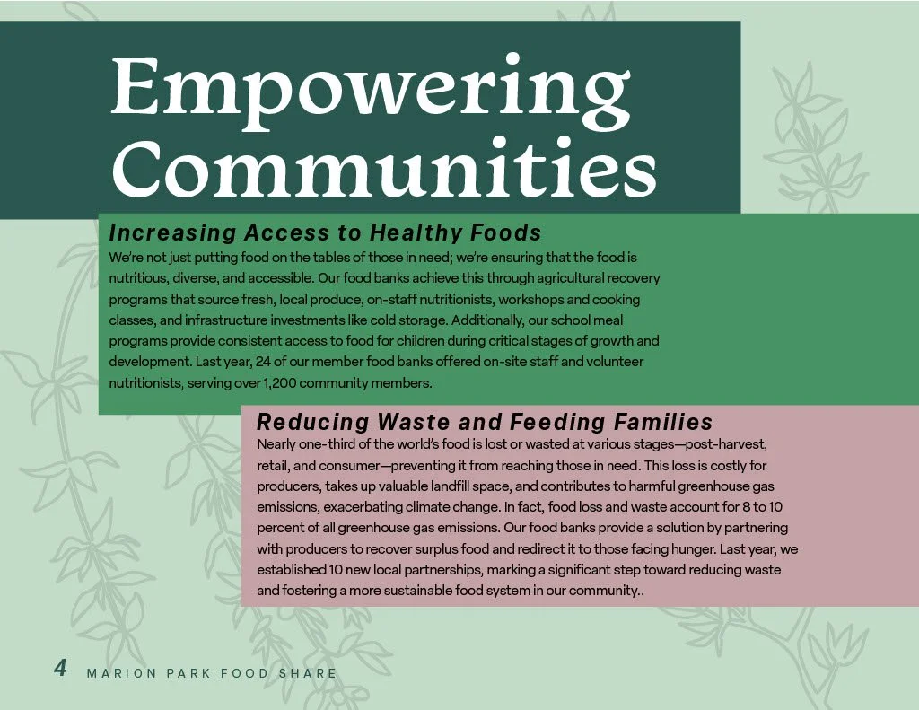
Empowering Communities

Core Values

Board of Directors

Financials

Financials (cont)
Final Thoughts
I enjoyed the creativity allowed to me to be able to design with very few restrictions on what I could decide. I learned that my design abilities have a lot of room to grow and develop, but applying the practice is the best way to do it. If I could go back and change my design or improve it, I would leave the background white and allow the design to breathe a bit more, as I feel the color is a bit overwhelming.